Monday, June 27, 2011
Monday, May 2, 2011
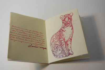
Photos of my Zine
Awhile ago I posted some of the images from my zine that I made for letterpress class, but here are some photographs of the actual constructed book.
Labels:
adobe photoshop,
animals,
antique,
book,
illustration,
photoshop,
vintage,
zine
Embroidered Lion Print
Not completely finished yet, but I had to photograph it for senior exit review so I thought I'd post it. I just have to embroider one or two more flowers!
And in case you were wondering how this was made, I'm really proud of how I did it, because to my knowledge nobody has ever done it before!! I sewed embroidery fabric onto museum board (with the help of Veronica Bayagich. Then after a few test prints, I inked up my lino carving and rolled it through the letterpress, and voila! Then I embroidered it with standard embroidery floss, which was pretty tough because getting the needle to go through museum board takes some extra effort.
Labels:
embroidery,
flowers,
letterpress,
linocut,
lion,
orange,
organic,
rust
Wednesday, April 27, 2011
85% Finished Cukoo Clock
So I letter-pressed my cuckoo clock design using photopolymer and this is the result! It was printed on quality paper then mounted on museum board and hand cut out with an Xacto. Needless to say my fingers hurt after cutting this bad boy out! Now all there's left to do is attach the letterpress pinecones with chain material! Final picture will be posted soon!
Labels:
cuckoo clock,
deer,
green,
illustration,
letterpress,
linework,
owl,
wood
Candle Packaging
The decals were a pain in the butt to apply, and I'm not particularly happy with them, so here is the candle packaging which I am happy with. I wanted it to be a simple, clean design with a boutique aesthetic.
Labels:
boutique,
candle,
day of the dead,
design,
illustration,
packaging
Tuesday, April 19, 2011
Letterpress Promo Package
Our last assignment in letterpress class is to create a promotional package of business cards and coasters. I'm using the personal logos I created in another class for them. I'm going to print the business cards black and white, but I'm probably going to play with the colors for the coasters. Promo packages mean it's coming down to the end of art school :( :( :(
Labels:
antlers,
business card,
coaster,
design,
keys,
lauren magda,
letterpress,
promotional
Saturday, April 9, 2011
MOO Pattern
My friend and classmate, Jongmee Kim, is doing an out of class collaboration project with me and a couple other people (Jackie Somerville and Veronica Bayagich). It's a milk packaging project called MOO. The girls and I each designed a pattern to use on our unique flavors of milk, which Jongmee will be designing the packaging for. I chose to do strawberry and this is the result! I really like to draw cute hedgehogs, though they're not usually affiliated with strawberries. haha :)
Labels:
adobe illustrator,
flowers,
hedgehog,
pattern,
pink,
strawberry
Wednesday, April 6, 2011
Muse Montage Poster
This poster is a compilation of my painting, Jellyfish drawing and pattern I did in photoshop for my advanced illustration and design class. I'm glad we had this assignment because it's a better fit in my portfolio than just the painting, I feel.
Labels:
band poster,
guitar,
jellyfish,
matthew bellamy,
muse,
oil,
oil painting,
painting,
poster,
wood
Sunday, April 3, 2011
Some ills from my ZINE
Here's a sneak peak at some of my illustrations I did for my Ephemera Zine. In my letterpress class, Mark Murphy http://www.murphydesign.com/ came to visit and do a workshop. He gave my class a zine assignment and its really awesome, I can't wait to pull an all-nighter tomorrow night in order to assemble all my zines! They're going to incorporate ribbon, little antique keys I found at a scrapbook store and crystal gem charms!
Dia de los Muertos Painting
Now that the painting is done, I'm ordering special decals for candles so I can put them on a flameless battery powered candle for the student show :) I'm also working on a couple packaging designs for the finished candle. I'll post those when they're done!
Labels:
animal skulls,
candles,
culture,
day of the dead,
decorative,
illustration,
mexican,
oil,
oil painting,
skulls,
tradition,
wood
Monday, March 28, 2011
I Won the Hagopian Rug Competition!
I've known for a couple weeks now, but I forgot to post about it on here. And....I never documented my design..But i'll be sure to take a million pictures of it and the rug at the student exhibition after graduation!!! I'm really excited to see my rug!
Detroit Poster for Somerset Contest!
It's finally finished. Here's my poster submission for Somerset and the Detroit Shoppe. And if you aren't aware, there used to be fallow deer that roamed free on Belle Isle, but now there are just a few in a fenced off area.
Labels:
belle isle,
decorative,
deer,
design,
detroit,
fountain,
illustration,
painting,
poster,
skyline
Monday, March 21, 2011
Geek Week T-Shirt
All my friends already had the class I'm currently in, where this t-shirt design was an assignment. So I already knew about it, and was coming up with ideas long before the class started. This design came to me right before I fell asleep one night haha. I thought the contrast of hardcore knuckle tattoos and geekery were quite funny.
Labels:
adobe illustrator,
calculator,
ccs,
design,
geek,
geek week,
hands,
knuckle tattoo,
tattoo,
tshirt
Personal Logos
I did these a little while ago in my Advanced Illustration and Design class. I like all of them. So it's hard to choose just one to use. I think I'll use a combination. Maybe...
Labels:
adobe illustrator,
antlers,
deer,
design,
keys,
lauren magda,
logo,
logos,
personal logo,
profile,
promotional
Thursday, March 10, 2011
Progress
Not the best lighting for this picture. But it shows how my process is going on my Day of the Dead painting. I'm happy with it so far.
Labels:
animal skulls,
day of the dead,
illustration,
in progress,
oil,
oil painting,
progress,
skulls,
wood
Tuesday, March 8, 2011
Color Rough
Very rough color study (photoshop) for my new painting based on the Mexican Day of the Dead celebration. I'm starting a new series of paintings for senior studio class, and this is the one I'm most excited about. The animal skulls will be my take on sugar skulls (and will have more decoration and ornamentation on them than what you see in the color rough, I just haven't drawn it in yet). The series is based on native art forms, roughly speaking. I say roughly speaking because Day of the Dead art is not typically considered a native art form as is say aboriginal art or Native American art (which will be the other two in the series).
I'm excited for this series because I'm trying to experiment more with layers. As you can see in this painting I've started the layering process. I used the Mexican cut paper decorations, commonly used in Day of the Dead offrendas as inspiration for the diamond pattern you see in the background of the piece. I first gesso-ed the wood panel, then hand painted the diamond pattern, using a lot of liquin in order to make the paint more transparent. I then applied two layers of watered down gesso over the dried pattern to subdue it. I might add a color glaze over the whole background when I'm done painting all the other elements, but I'm not sure yet.
Labels:
adobe photoshop,
color rough,
color study,
day of the dead
Monday, March 7, 2011
Sunday, February 27, 2011
First Letterpress Print!
This is my broadside poster for Letterpress class. It's a Death Cab for Cutie lyric. I just really wanted to illustrate ornate keys and a locket :p
Labels:
antique keys,
broadside poster,
design,
illustration,
letterpress,
lyrics,
poster,
printmaking,
typography,
wood type
Subscribe to:
Posts (Atom)